- phoneUSA: +1 800-322-7860 (Sales)
- UK: +44 (0)20 3332 0860 (Sales)
- AU: 1300 857 860 (Sales)
- International
WORK[etc] Web App Blog
Contacts now available for Public Beta
11
May
May
From today, all accounts will be able to access the new contacts module, bookmarks tool and streamlined interface.
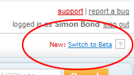
To switch between the old and the new, simply click the new link in the top right hand corner of your screen:

Once we've worked through any bugs (hopefully none!) we'll create a walk-through video highlighting all the new cool stuff. But for now bullet points....
Interface:
The contact history tool lets you view your businesses entire interaction with a customer. More on this shortly....
To switch between the old and the new, simply click the new link in the top right hand corner of your screen:
Once we've worked through any bugs (hopefully none!) we'll create a walk-through video highlighting all the new cool stuff. But for now bullet points....
Interface:
- Any pages on which you do something can now be bookmarked. This means that the page is always accessible from the right hand panel.
- This right hand panel can now be collapsed to make more horizontal space for your work.
- The top menu bar is slimmer and the WORKetc branding less intrusive
- The top menu bar is always clickable, reducing the number of clicks needed to get around.
- Most pages have breadcrumb navigation to help get a feel of where you are in the application and to easily let you bounce around pages.
- A lot of functionality is now available in a floating window, rather than loading a new page.
- Contact directory is now presented in a table format for better presentation and sorting ability.
- Any contact row can be expanded to quickly access frequent contact details
- Contact detail screen now requires much less scrolling, making better use of the screen space available
- We bring to the forefront the contact history tool. This is actually one of the most powerful features of WORKetc, but until now we've kind of hidden away ....
The contact history tool lets you view your businesses entire interaction with a customer. More on this shortly....
Product Releases
Big News
Coalface
- Oil makes everything go faster... right?
- Build a better product by getting your feet really dirty (& what is coming next)
- A Getting Things Done (GTD) approach for WORK[etc]
- Welcome to the SSD club, Amazon EC2 (and how SSD's powered a 714% Performance Increase)
- Four Questions that Bring Teams Together
- See all from Coalface
Archive
- 2013 May
- 2013 Apr
- 2013 Mar
- 2013 Jan
- 2012 Oct
- 2012 Oct
- 2012 Sep
- 2012 Aug
- 2012 Jun
- 2012 Jun
- 2012 May
- 2012 Apr
- 2012 Mar
- 2012 Feb
- 2012 Jan
- 2011 Dec
- 2011 Nov
- 2011 Oct
- 2011 Sep
- 2011 Aug
- 2011 Jul
- 2011 Jun
- 2011 May
- 2011 Apr
- 2011 Mar
- 2011 Feb
- 2011 Jan
- 2010 Dec
- 2010 Nov
- 2010 Sep
- 2010 Aug
- 2010 Jul
- 2010 Jun
- 2010 May
- 2010 Apr
- 2010 Mar
- 2010 Jan
- 2009 Oct
- 2009 Sep
- 2009 Jul
- 2009 Jun
- 2009 May
- 2009 Apr
- 2009 Mar
- 2009 Feb
- 2008 Nov
- 2008 Aug
- 2008 Jul
- 2008 Jun
- 2008 May
- 2008 Apr
- 2008 Mar
- 2008 Feb
- 2008 Jan
- 2007 Dec
- 2007 Oct
