- phoneUSA: +1 800-322-7860 (Sales)
- UK: +44 (0)20 3332 0860 (Sales)
- AU: 1300 857 860 (Sales)
- International
WORK[etc] Web App Blog
New version released
27
Feb
Feb
If you haven’t been keeping up with our numerous blog and twitter posts announcing this major update or if you’ve missed the announcement inside of your WORKetc account, or if you haven’t tried out the beta before today, then logging into your WORKetc account might have been a bit of a surprise.
Over this weekend we promoted a number of revised WORKetc tools from beta to public release; meaning that all WORKetc accounts have now been upgraded to the new version.
The following key areas of WORKetc have all been updated:
Before I go into the details, the biggest issue some people may see in their accounts is going to be seemingly missing Projects or ToDos’.
Do not worry. They aren’t missing.
It is just that some people with custom filters may have settings applied that will hide some items from view in the new version. This is very easily fixed. Simply go into the projects and to-do screen and turn the filters to:
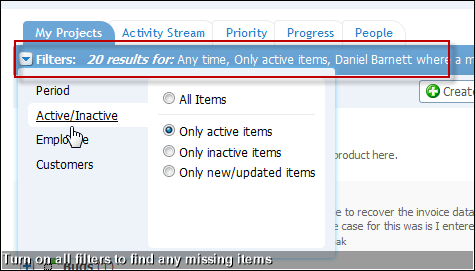
This will of course show everything under your account. It is then just a matter of adjusting these filters to show the information that you want to see.
Whilst this new set up may be annoying to set up, the benefit is that allows you much more control over the information you see. Particularly useful for some of our clients that are running hundreds of projects at any one time.
New in Project Management
Project management online should not just be a dumping ground for everything to do with a project. Most tools feel like this; you log into an account, find a project and then throw everything to do with your project at it. Maybe label some of the items and maybe tick off a few milestones. I don't see how this is really different to email. We wanted a system whereby you actually worked on a project in that space.
We also wanted to be able to view a project from a number of perspectives, allowing people to choose their work style based on task or role.
And then of course there was 18 or so months of customer feedback, logic holes and suggestions made in the forums.
So this is how it turned out...
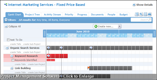
First, what the different tab views show:
Gantt Chart(shown above).
This shows a visual timeline of the project, including sub project and todo hierarchy, linked or dependent sub projects and other visual indicators such as priority (red flag) and recoded data (speech bubble with an "i").
When you would use it: This tab is useful to quickly set up a new project. As well as being able to drag and drop to create project dates, you also hit the tab button and rapidly create new ToDos or Sub Projects or just select the tick box to mark an item as complete.
This view is also critical to visualise how a project is progressing in terms of completion or key milestones.
Project Tree
The Project Tree view is a simple relationship hierarchy of Projects, Sub Projects and ToDos.
When you would use it: Use this tab to quickly view what individual items make up a project and to add new items to a project. Using this view it is simple to find a particular sub project and to create new items under that sub project.
Activity Stream
This is the project conversation. Everything that happens under a project is fed into the project stream and sorted by date order; the end result is a constant feed of activity, with the ability to drill up or down in hierarchy by switching to a different tab view.
When you would use it: The Activity Stream makes it easier to get up to date on a project and to collaborate in real time. Using the filters (mentioned at the start of this post) you can customise what information you want to see in your project feed.
Priority, Progress, Documents & People
These views are self-explanatory. Essentially they are filtered views of the project. So, for example the Priority view is all items under a project, sorted by priority, the people view is all items sorted and people.
Budget Tab
The new budget tab has been upgraded to allow discrete line view of how each sub project is tracking and then an overall view of project budget, taking into account logged time, milestone payments, expenses and more. The diagram below best illustrates this:
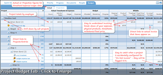
Ironically we used our new project management tool, to manage the development of our new project management tool...
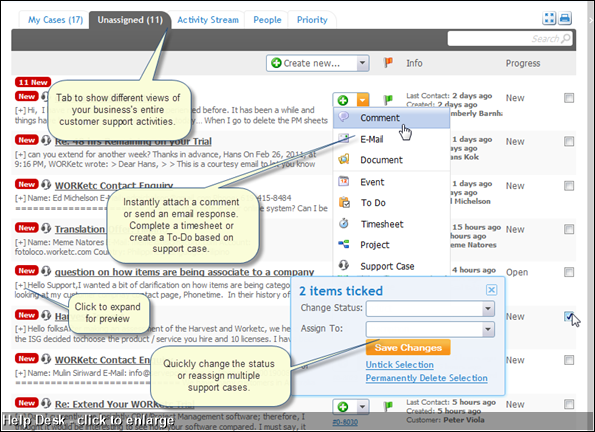
The coolest thing here is the new Activity Stream view. This gives you a real time feed of everything to do with customer support, across your entire business.
...continued after I drink more coffee, shortly...>>>
Over this weekend we promoted a number of revised WORKetc tools from beta to public release; meaning that all WORKetc accounts have now been upgraded to the new version.
The following key areas of WORKetc have all been updated:
- Projects
- ToDo List
- Help Desk
- Time sheets
- Calendar
Missing Projects? Missing ToDos?
Before I go into the details, the biggest issue some people may see in their accounts is going to be seemingly missing Projects or ToDos’.
Do not worry. They aren’t missing.
It is just that some people with custom filters may have settings applied that will hide some items from view in the new version. This is very easily fixed. Simply go into the projects and to-do screen and turn the filters to:
- Period: Anytime
- Active/Inactive: All items
- Employee: Everyone
- Customers: Leave unselected
This will of course show everything under your account. It is then just a matter of adjusting these filters to show the information that you want to see.
Whilst this new set up may be annoying to set up, the benefit is that allows you much more control over the information you see. Particularly useful for some of our clients that are running hundreds of projects at any one time.
New in Project Management
Project management online should not just be a dumping ground for everything to do with a project. Most tools feel like this; you log into an account, find a project and then throw everything to do with your project at it. Maybe label some of the items and maybe tick off a few milestones. I don't see how this is really different to email. We wanted a system whereby you actually worked on a project in that space. We also wanted to be able to view a project from a number of perspectives, allowing people to choose their work style based on task or role.
And then of course there was 18 or so months of customer feedback, logic holes and suggestions made in the forums.
So this is how it turned out...
First, what the different tab views show:
Gantt Chart(shown above).
This shows a visual timeline of the project, including sub project and todo hierarchy, linked or dependent sub projects and other visual indicators such as priority (red flag) and recoded data (speech bubble with an "i").
When you would use it: This tab is useful to quickly set up a new project. As well as being able to drag and drop to create project dates, you also hit the tab button and rapidly create new ToDos or Sub Projects or just select the tick box to mark an item as complete.
This view is also critical to visualise how a project is progressing in terms of completion or key milestones.
Project Tree
The Project Tree view is a simple relationship hierarchy of Projects, Sub Projects and ToDos.
When you would use it: Use this tab to quickly view what individual items make up a project and to add new items to a project. Using this view it is simple to find a particular sub project and to create new items under that sub project.
Activity Stream
This is the project conversation. Everything that happens under a project is fed into the project stream and sorted by date order; the end result is a constant feed of activity, with the ability to drill up or down in hierarchy by switching to a different tab view.
When you would use it: The Activity Stream makes it easier to get up to date on a project and to collaborate in real time. Using the filters (mentioned at the start of this post) you can customise what information you want to see in your project feed.
Priority, Progress, Documents & People
These views are self-explanatory. Essentially they are filtered views of the project. So, for example the Priority view is all items under a project, sorted by priority, the people view is all items sorted and people.
Budget Tab
The new budget tab has been upgraded to allow discrete line view of how each sub project is tracking and then an overall view of project budget, taking into account logged time, milestone payments, expenses and more. The diagram below best illustrates this:
Ironically we used our new project management tool, to manage the development of our new project management tool...
Main Project Directory Screen
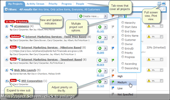
Aside from the new design, there are a number of usability enhancements to the main project screen. Screen grab below, click to enlarge:TimeSheets - Time Tracking
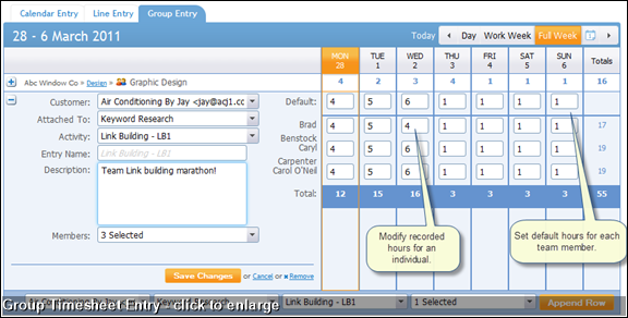
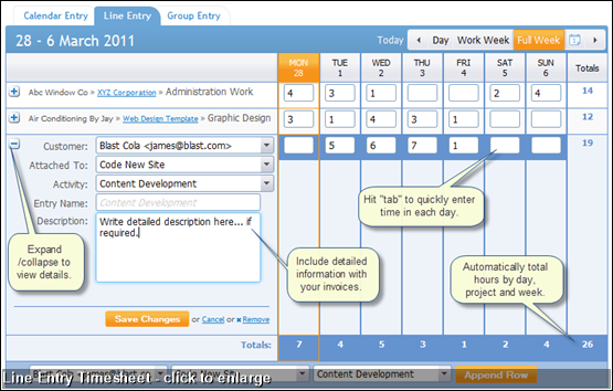
This entire module got a huge make over. Most notably the ability to choose how you enter time:- Drag and Drop on a Calendar View
- Line entry for each day of the week
- Group entry to manage timesheets on behalf of other people.
Customer Support / Help Desk
Again, huge improvements in usability and user experience. I'll show these below, rather than explain.The coolest thing here is the new Activity Stream view. This gives you a real time feed of everything to do with customer support, across your entire business.
...continued after I drink more coffee, shortly...>>>
Product Releases
Big News
Coalface
- Oil makes everything go faster... right?
- Build a better product by getting your feet really dirty (& what is coming next)
- A Getting Things Done (GTD) approach for WORK[etc]
- Welcome to the SSD club, Amazon EC2 (and how SSD's powered a 714% Performance Increase)
- Four Questions that Bring Teams Together
- See all from Coalface
Archive
- 2013 May
- 2013 Apr
- 2013 Mar
- 2013 Jan
- 2012 Oct
- 2012 Oct
- 2012 Sep
- 2012 Aug
- 2012 Jun
- 2012 Jun
- 2012 May
- 2012 Apr
- 2012 Mar
- 2012 Feb
- 2012 Jan
- 2011 Dec
- 2011 Nov
- 2011 Oct
- 2011 Sep
- 2011 Aug
- 2011 Jul
- 2011 Jun
- 2011 May
- 2011 Apr
- 2011 Mar
- 2011 Feb
- 2011 Jan
- 2010 Dec
- 2010 Nov
- 2010 Sep
- 2010 Aug
- 2010 Jul
- 2010 Jun
- 2010 May
- 2010 Apr
- 2010 Mar
- 2010 Jan
- 2009 Oct
- 2009 Sep
- 2009 Jul
- 2009 Jun
- 2009 May
- 2009 Apr
- 2009 Mar
- 2009 Feb
- 2008 Nov
- 2008 Aug
- 2008 Jul
- 2008 Jun
- 2008 May
- 2008 Apr
- 2008 Mar
- 2008 Feb
- 2008 Jan
- 2007 Dec
- 2007 Oct
