- phoneUSA: +1 800-322-7860 (Sales)
- UK: +44 (0)20 3332 0860 (Sales)
- AU: 1300 857 860 (Sales)
- International
WORK[etc] Web App Blog
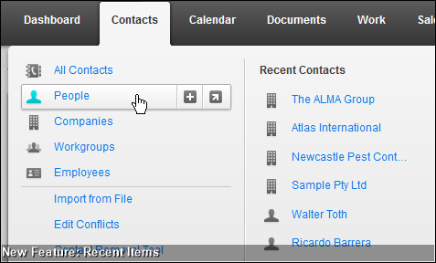
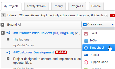
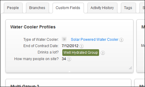
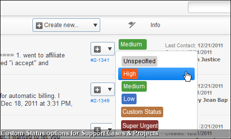
WORK[in progress] - our new interface revealed.
30
Jun
Jun
So I've just trawled through 12 months of feedback from customers offering opinions around our web-app's user interface design. We have 69 people who've written in to say they love it, 88 people who say they hate it and strangely one guy just asking to change a particular hue of orange.
With the exception of orange-guy, the feedback is all passionate to the point of being divisive. At the negative end of the spectrum we have a response that is in all capitals "HORRIBLE - CIRCA 2005" and from the positive end, "love the CRM, love the interface!!!!" including no less than 12 exclamation marks.
Clearly no one that has offered feedback is sitting on the fence. Rather both sides have run to their respective end of the yard and are poised to pitch rocks and sling rotten eggs at one another. And as much as I used to enjoy a good backyard scrap (hey, I was 9 years old) it's time to put an end to this and start showing off the new interface design.
As an aside: I've noticed people with negative views tend to use all capital letters whereas positive people are more about the exclamation mark (!!!!)
Sneak Preview
Beta & Release Dates
From today this is in "internal beta' @ WORK[etc]. What this means is that we have it to a stage whereby we can easily use the new interface to quickly identify the obvious quirks. This internal beta will last ~2 weeks.
Then we move to a "public beta". What this means is that any account can flick a switch on their interface and turn on the new beta. A warning though. This is likely going to be a "no going back" scenario because of updates and new features that apply to the underlying database.
After around ~6 weeks in public beta, and with plenty of warning, all accounts will be switched over to the new interface.
View the progress forum for some more screens and updates.
Product Releases
Big News
Coalface
- Oil makes everything go faster... right?
- Build a better product by getting your feet really dirty (& what is coming next)
- A Getting Things Done (GTD) approach for WORK[etc]
- Welcome to the SSD club, Amazon EC2 (and how SSD's powered a 714% Performance Increase)
- Four Questions that Bring Teams Together
- See all from Coalface
Archive
- 2013 May
- 2013 Apr
- 2013 Mar
- 2013 Jan
- 2012 Oct
- 2012 Oct
- 2012 Sep
- 2012 Aug
- 2012 Jun
- 2012 Jun
- 2012 May
- 2012 Apr
- 2012 Mar
- 2012 Feb
- 2012 Jan
- 2011 Dec
- 2011 Nov
- 2011 Oct
- 2011 Sep
- 2011 Aug
- 2011 Jul
- 2011 Jun
- 2011 May
- 2011 Apr
- 2011 Mar
- 2011 Feb
- 2011 Jan
- 2010 Dec
- 2010 Nov
- 2010 Sep
- 2010 Aug
- 2010 Jul
- 2010 Jun
- 2010 May
- 2010 Apr
- 2010 Mar
- 2010 Jan
- 2009 Oct
- 2009 Sep
- 2009 Jul
- 2009 Jun
- 2009 May
- 2009 Apr
- 2009 Mar
- 2009 Feb
- 2008 Nov
- 2008 Aug
- 2008 Jul
- 2008 Jun
- 2008 May
- 2008 Apr
- 2008 Mar
- 2008 Feb
- 2008 Jan
- 2007 Dec
- 2007 Oct
